
About this entry
You're currently reading Altered Carbon.
- Published:
- on December 16, 2008
- Category:
- book
- Previous:
- Older Post
- Next:
- Newer Post
-
December 16, 2008 at 4:03 PM
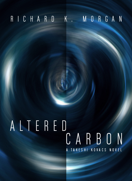
My standard for sci-fi and fantasy covers is "not embarrassing to carry on the bus." They usually depict some kind of too-cool hero clutching a gun, sword and/or a hot babe. No thanks.
The original covers for the Kovacs novels are pretty bad -- a mix of cliche grunge design and old cyberpunk. I decided to go abstract with these, trying to create a mood with shapes and colors rather than depicting anything specific from the books. -
December 17, 2008 at 9:24 PM
Abstract FTW. I find that most science-fiction cover imagery (including that on the existing Altered Carbon cover) to be either random, lame, misleading or disappointing based on how I imagine the book. These are nice, distinctive, and enjoyable to look at.
Your cover also has the virtue of having readable text, something I now notice escaped the paperback cover designer. Yellow text on a yellow background? Well done, random cover designer. Those footsteps you hear belong to John Harper. - December 19, 2008 at 11:50 AM

3 comments: