
About this entry
You're currently reading The Cold Six Thousand.
- Published:
- on December 22, 2008
- Category:
- book
- Previous:
- Older Post
- Next:
- Newer Post
- December 22, 2008 at 2:25 AM
-
December 22, 2008 at 11:29 AM
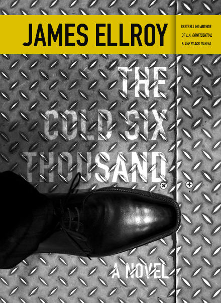
Oh man! This is fantastic. Another example of taking a static photo and using crop and orientation to give it a sense of motion. I feel like the person attached to that shoe is about to go kick some ass.
I love what you did with the type, too, and how you worked the ribbon at the top into the seam of the floor. I like the Chip Kidd cover (http://en.wikipedia.org/wiki/File:Cold_Six_Thou.jpg) but I think yours hangs together better visually. This might be a weird way to think about it, but I think the contrast and type on your cover would make it stand out better on the shelf, too.
I am learning so much about graphic design by watching what you do with photos I think I understand. I hope everyone out there is enjoying the master class as much as I am.

![[ chip kidd's cover ]](http://en.wikipedia.org/wiki/File:Cold_Six_Thou.jpg)
2 comments: